| | Bloodlust's WIP (and some arguably dodgy painting!) |  |
|
|
| Author | Message |
|---|
Bloodlust_Rellik
Xenophobic Space Marine
Posts : 106
Awesomeness : 4410
Location : .............BOO!............
 |  Subject: Bloodlust's WIP (and some arguably dodgy painting!) Subject: Bloodlust's WIP (and some arguably dodgy painting!)  Sat Oct 13, 2012 10:40 am Sat Oct 13, 2012 10:40 am | |
| Right some opinions please; I've pretty much got my colour scheme now - as always opinions and advice most welcome! Due to the restrictions of my phone, you'll have to head over to my gallery to check out a couple of pictures I've put on there as I can't post them in this thread but especially would like thoughts on the "lightning effect" of the force sword I'm having a go at so I can perfect it a little more for future models..... | |
|
 | |
Taffiarti
Fabricator-General of the Meccanocum

Posts : 326
Awesomeness : 4864
Location : Right where you least expect me....
| | Subject: Re: Bloodlust's WIP (and some arguably dodgy painting!) Sat Oct 13, 2012 11:23 am | |
|  OK, so here is an example of my power swords (apologies for the blurry pic. Even I get tired sometimes!). This is not the best example as it was one of the first I have done, but the principle is still the same. Here are the steps that I do (for red obviously): -Finish the handle completely -Basecoat in foundation red (melachite red) -A layer of deep red (scar red) -A fairly generous highlight layer towards the centre ridge an the edges - not on this example (mix of scar red and blood red, maybe 3:1 ratio). This is just to offer a slight depth to the sword. Without the power element I would gradient this up. -Next I add the lightning bolts. Now the point of this is to try and make it look like the sword has a power field over it. This means it has to be all over. But where does the power come from? In this example it is meant to be coming from an energy node about a third from the base of the sword. But as its random its hard to tell! - So I find my starting point and paintfairly thin lines along one side of the sword, turn over and repeat (blood red). It's really mportant that it goes over the edges and that the front and back match othr wise it won't look like the energy is going all over the sword. - Next I take a bright highlight colour (blazing orange) and paint between the lines of the red. In this example I have covered done a thin line in all the blood red, but you don't have to, as long as it looks powerful. - In my current versions I now add a part of yellow too (sunburst yellow?). This is really thin now and only goes at the points of the interception. (not shown) - The I add dabs of white. To try and imagine how its meant to look imagine a crossroad. That cross road has pavements either side. The entire cross road is red. I then paint the roads leading up to it, and the cross road itself orange. Then the crossroads and the stupid cyclist bit yellow, and finally the middle of the crossroads white. In my head its a great example, but it's half one so it might not work. The special bit I do is to us a gloss varnish to make it stand out from the model and to give an almost "liquid" appearance. Anyway, that's how I roll! Any q's let me know! | |
|
| | |
Hobowan
Fabricator-General of the Meccanocum

Posts : 302
Awesomeness : 4795
| | Subject: Re: Bloodlust's WIP (and some arguably dodgy painting!) Mon Oct 15, 2012 7:19 am | |
| i think i prefer the mirrored type approach to force-swords this is a hot of what i did on one of my stormboyz for no apparent reason  i didnt do a very good job, but i think the principle looks better than lightning. i just shaded from extreme blue to extreme light as i went down the blade, and did the opposite on the way back up by the way, really like the storm ravens, love the colour scheme | |
|
| | |
Taffiarti
Fabricator-General of the Meccanocum
Posts : 326
Awesomeness : 4864
Location : Right where you least expect me....
| | Subject: Re: Bloodlust's WIP (and some arguably dodgy painting!) Mon Oct 15, 2012 8:18 am | |
| I think it is quite a hard one to judge. I personally don't like the second example. Its purely as the sword doesn't make sense to me. Where is the power? Why is it mirrored? Surely a progression up the entire weapon makes more sense? Especially if it is done with edge highlights and gradual blending too. This is not to say the lightning is good. I'm not convinced of on it at all. but it is a clear difference between that and a normal sword, which I do like. I also quite like several wash layers on a finished metal sword. It gives a good tint more than anything, but does make it look different to standard weapons. I have used it for my thunder hammers and I like the effect. Especially if you use creative pooling of the wash as it makes each sword different.
The other thing is that do you have plain power swords in your army? It just dawned on me that you were talking about force swords, not power swords. Perhaps the mirror or the wash would be better thinking on it beaches it doesn't have
the same mechanics as a power sword. | |
|
| | |
Hobowan
Fabricator-General of the Meccanocum
Posts : 302
Awesomeness : 4795
| | Subject: Re: Bloodlust's WIP (and some arguably dodgy painting!) Mon Oct 15, 2012 8:42 am | |
| if you cant choose, why not go for both!  thats the mirror approach with just a thin light blue line going around. THIN is the operative word methinks as chunky would end up spoiling the effect | |
|
| | |
Taffiarti
Fabricator-General of the Meccanocum
Posts : 326
Awesomeness : 4864
Location : Right where you least expect me....
| | Subject: Re: Bloodlust's WIP (and some arguably dodgy painting!) Mon Oct 15, 2012 8:51 am | |
| That is a great shout actually. I might have to try and find a tutorial for that myself! | |
|
| | |
Sarentia
Snotling
Posts : 6
Awesomeness : 4253
| | Subject: Re: Bloodlust's WIP (and some arguably dodgy painting!) Mon Oct 15, 2012 9:48 am | |
| That, to me, is exactly how I see power weapons in my head, and the effect I try to copy. I think, personally, the lighting effect should be as thin as possible. Otherwise it looks too chunky on the weapon. It gives the impression of lots of lightning crackling over the surface, like the power source is souped up. Plus it can stand out from the model in a subtle way. | |
|
| | |
Bloodlust_Rellik
Xenophobic Space Marine
Posts : 106
Awesomeness : 4410
Location : .............BOO!............
| | Subject: Re: Bloodlust's WIP (and some arguably dodgy painting!) Tue Oct 16, 2012 2:50 am | |
|
Ok I've just read the difference between the 2 and to be honest I thought they'd be the other way around; how would a force weapon be represented better then if its "charged with psychic power"? I do like the lightning effect and I agree with sarentia in that the lightning needs to be as thin as possible but it's bloody hard to do!! But to throw a further spanner in the works, there are some drawings of melee weapons in the rulebook and they're represented back to front again!( power sword looks normal, force staff in this instance has the lightning - so confused!) | |
|
| | |
Taffiarti
Fabricator-General of the Meccanocum
Posts : 326
Awesomeness : 4864
Location : Right where you least expect me....
| | Subject: Re: Bloodlust's WIP (and some arguably dodgy painting!) Tue Oct 16, 2012 3:35 am | |
| Feel free to ignore all source material and do what you thinks better. The main thing to remember is that you have to be able to paint it and to like it after you've done it! I'm going to have a play around tonight on a spare sword and see what I come up with! | |
|
| | |
Taffiarti
Fabricator-General of the Meccanocum
Posts : 326
Awesomeness : 4864
Location : Right where you least expect me....
| | Subject: Re: Bloodlust's WIP (and some arguably dodgy painting!) Tue Oct 16, 2012 9:59 am | |
| Based Upon this conversation, what we have talked of our selves, and your colour scheme, I came up with this: 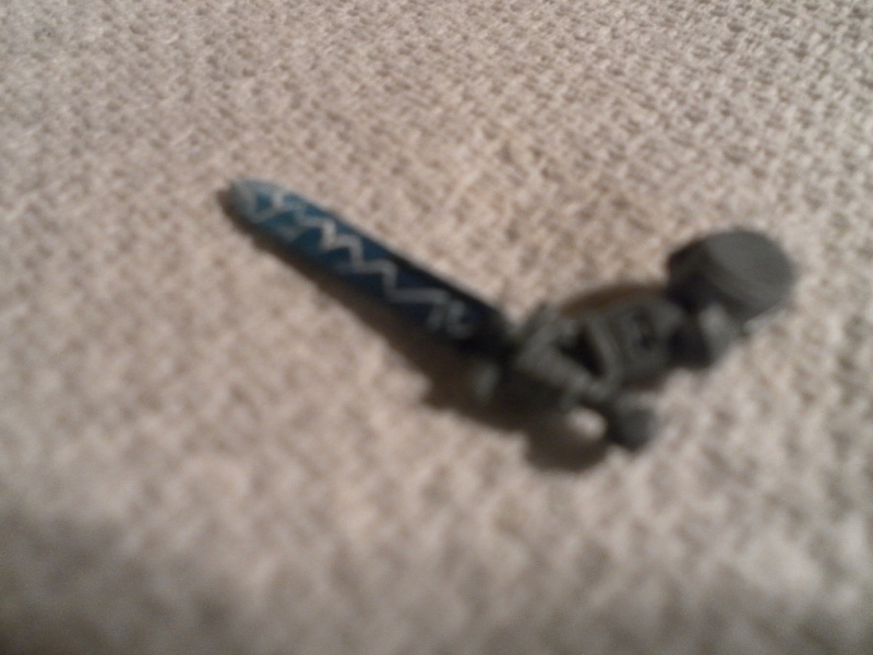 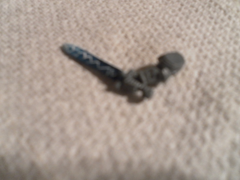 I really wish I could take better photos. I have done a gradient of really dark blue through to white. at the swords tip. I have done a thin lightning effect that's white. So it's more dominant at the bottom than the top. My thought was the psychic power would be more focussed nearer it's source (the grey knight) and would be spread out further where the power gathered at the tip. This is not my best work by any stretch of the imagination but I hope it gives an idea. | |
|
| | |
Bloodlust_Rellik
Xenophobic Space Marine
Posts : 106
Awesomeness : 4410
Location : .............BOO!............
| | Subject: Re: Bloodlust's WIP (and some arguably dodgy painting!) Wed Oct 17, 2012 4:39 am | |
| Like the idea, and I am a fan of the shading tho can't quite see the whole effect clearly; you'll have to bring it with you Friday!  | |
|
| | |
Hobowan
Fabricator-General of the Meccanocum
Posts : 302
Awesomeness : 4795
| | Subject: Re: Bloodlust's WIP (and some arguably dodgy painting!) Sun Oct 21, 2012 8:39 am | |
| found this on dakka dakka, and its one of my favourite takes on a force/power sword. i may be wrong, but i think hes not used metal paint and has instead gone from grey to blue to white. not the most impactful sword ever, but i think the subtelty makes it scream "special" 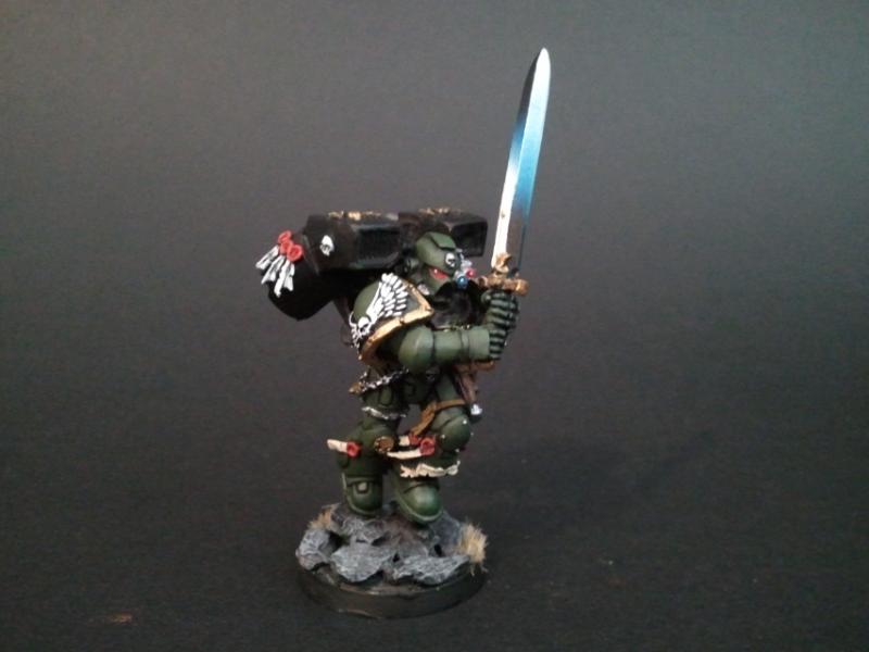 | |
|
| | |
Stryph
Hive World Slum Lord

Posts : 221
Awesomeness : 4703
Location : Outside your bathroom window
| | Subject: Re: Bloodlust's WIP (and some arguably dodgy painting!) Sun Oct 21, 2012 9:10 am | |
| liking that look a lot!
I really struggled with the powerswords on my sanguinary guard - I hate the look I've done on them and will have ot go over them again at some point, I went the lightning route, painting lines that small whilst keeping them looking like lightning was really really hard. I don't think I'd go that way again 1 slight slip, wobbly line or slightly wrong angle and it ruins it. I have a tendency to hate everything I do though! | |
|
| | |
Taffiarti
Fabricator-General of the Meccanocum
Posts : 326
Awesomeness : 4864
Location : Right where you least expect me....
| | Subject: Re: Bloodlust's WIP (and some arguably dodgy painting!) Sun Oct 21, 2012 9:19 am | |
| I'm reading on my phone so the picture isn't the best, but it looks metaillic to me! What has he done? How would you think it is painted? | |
|
| | |
Hobowan
Fabricator-General of the Meccanocum
Posts : 302
Awesomeness : 4795
| | Subject: Re: Bloodlust's WIP (and some arguably dodgy painting!) Sun Oct 21, 2012 9:47 am | |
| it looks horrendously simple. a single coat of grey on one end, a single coat of white on the other and a single coat of ice blue in the middle blend the blue and done! definitely have to try that on some looted orky blade | |
|
| | |
Sponsored content
| | Subject: Re: Bloodlust's WIP (and some arguably dodgy painting!) | |
| |
|
| | |
| | Bloodlust's WIP (and some arguably dodgy painting!) | |
|

